After a week off (the withdrawl was hell) The Daily Show has returned...with a new set. Now I'm all for change and and upgrade in technology, but the new look of one of the best shows on television has somehow managed to appear as cold and uptight as the multitude of pundit-filled talk shows one can find on any of the 24-hour news channels; the very same shows The Daily Show mocks so well.
Slate writer
Dana Stevens takes on the topic in a piece titled Talk Show Feng Shui. As I read I couldn't help but nod my head and agree with more than a few of her observations.
On the new Daily Show set, both desk and couch have been replaced by a large bean-shaped conference table in a drab grayish white, behind which both Stewart and his guest sit upright in rolling chairs. This setup gives the interview segment of the show a far more formal feel than before, like a Sunday morning public-affairs show.... As Stewart and the guest converse, we see them both only from the waist up, hands folded demurely on the table with their mugs and books between them.
The new desk looks like the kind of table you could find at most public libraries around the country (ten bucks there's already gum underneath it and a sticky spot right where your elbow rests). It is cold and drab and, to be honest, looks cheap as hell. The previous desk was huge, bright blue, and while lit up, radiated the same feeling of fun as the man who sat behind it...then Lewis Black ended his rant and the cameras went back to Jon Stewart.
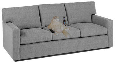
The guests' couch, on the other hand, is all about informality and coziness: Make yourself at home, it says, never mind the audience and those silly cameras. When the interview portion of the show began, Stewart used to stand up and walk over to the edge of the couch to greet his guest with a handshake (always a fun chance to compare the guest's stature with that of the wee Stewart), then usher him or her back to the sofa for a chat. The advantages of the couch format are multifold. Guests can not only be seen from head to foot, giving us a sense of their physical presence, their posture, and even their choice of shoes; they can also use the space however they want.
And people did use it however they wanted. Most sat upright on the side closest to Stewart with legs together and feet on the floor, sometimes reaching for their mug to take a sip of what most likely was moonshine made by Stewart himself. Others draped themselves out across the couch looking as relaxed as they would on their own couch in their living room. Recently Will Ferrel even feigned a nap after unzipping his fly. You can't do that in an office chair...well, not without some significant physical discomfot and a high liklihood of a sexual harassment suit being filed by a coworker.
Then there's the issue of the background screen. In the era before the move, Stewart sat in front of a large graphic of a world map. At the top of the show, large capital letters reading "The Daily Show" would scroll by behind his head, but they were transparent, superimposed on an aerial view of Manhattan's skyline that gave a feeling of openness to the space behind his desk. Now, the only graphic visible behind Stewart for the full half-hour is a continuous scroll-by of the words "The Daily Show" in solid cobalt blue. As if this constant movement of letters weren't distracting enough, the words "The Daily Show" also continuously radiate forward from the back of the screen in smaller white caps, originating from directly behind Stewart's head....On its own, the continuous blue scroll might have been forgivable, though it does give the studio a more claustrophobic feel than before. But those radiating white caps are just maddening. It's as if Stewart's head is actually producing the letters, like promotional dandruff.The background as a whole, not just the radiating white caps, is maddening. Not like
bovine spongiform encephalopathy maddening, but more like 'why is it that I can't go 60 seconds without laughing at this?' maddening.Despite trying to focus on Stewart as he pontificates on material that you just can't make up, you can't help but be a little distracted by the background flashing behind him. Stewart, for comedic purposes, has always wanted to be able to put himself in front of the graphics and pictures that are flashed on screen during the news portion of the show, and now he can as they are displayed on the screen located behind him (note: he has already molested the private area of one picture).
The new set won't keep anyone from watching as the writing is still fantastic and Stewart and Co. are still the best fake news people on the planet, but the new look smacks of The Daily Show taking themselves a bit too seriously, and a lack of seriousness is the halmark of this truly great show.
Let me end by saying that the new set, with it's cold, serious design reminds me of another show Stewart has been on, Crossfire. Just give him a bow-tie and a surgically remove his spine...and I've said too much.
Please look for less serious comments on this topic here and at our affiliate blog: tedhitler.blogspot.com.


